Skip to main contentSkip to navigationSkip to navigation

London, reimagined: alternative tube maps – in pictures

This article is more than 8 years old

As London prepares to vote for a new mayor, explore some surprising angles on the city – from life expectancy to cost of living – in alternative underground maps

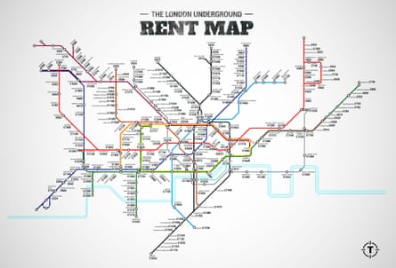
Cost of living. This map reveals the average monthly cost of renting a one-bedroom flat at every stop on the London Underground network. Hyde Park is the most expensive at £2,920m, and Hatton Cross comes in cheapest at £324. Photograph: Thrillist
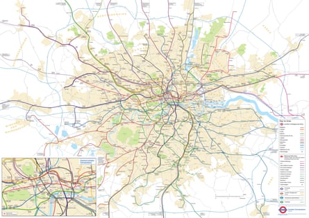
Geographically accurate. This map shows the accurate layout of the tube network, and the real distances between each stop. Photograph: Transport for London
Life expectancy. In the Lives on the Line project, academics at UCL have mapped the average length of life of residents at each tube stop on the Underground network. See the full version here. Photograph: James Cheshire
Disabled use. The Centre for Advanced Spatial Analysis at the Bartlett, UCL used TfL data of Disabled Freedom Pass Card journeys to create real-time visualisations of tube use by disabled people.
Art nouveau. A map produced in the style of Glaswegian architect and designer Charles Rennie Mackintosh. The map displays the Underground network as it would have been at the time of his death in 1928. Photograph: Max Roberts
The tube in 3D. Brazilian web developer Bruno Imbrizi has used publicly available data from TfL to create this three-dimensional visualisation of the tube system, with each dot representing a station. View the interactive version here. Photograph: Bruno Imbrizi
Everything in one map. Created by cartographer Franklin Jarrier, this map combines detailed track diagrams with the geographical layout of the entire network, showing every platform, line and interchange. Photograph: Franklin Jarrier
The Night Tube. Despite various initial launch dates, the most recent being January 2016, strike action means the after-hours service – which currently runs in cities like Berlin, Sydney and Copenhagen – has been delayed. The Night Tube map, released by TfL, simply used a normal tube map and removed the lines not included – but Max Roberts has created this new, contextualised version. Photograph: Max Roberts
London plays New York. The London Underground in the style of the Big Apple’s subway map from 1972. Photograph: Max Roberts
The future, as seen in 2004. Twelve years ago, based on developments in the pipeline, TfL created a map of what the transport network would look like in 2016. It looks relatively the same as the real thing today, with the major difference being Crossrail, which has faced several delays since this optimistic map was published. Photograph: Transport for London
Allow content provided by a third party?

This article includes content hosted on simonrogers.cartodb.com. We ask for your permission before anything is loaded, as the provider may be using cookies and other technologies. To view this content, click 'Allow and continue'.

The pedestrian tube. This map shows the time on foot between each station. The shortest gap is the 300 metres between Leicester Square and Covent Garden ... which even TfL recommends you walk. Photograph: Transport for London

Comments (…)

Sign in or create your Guardian account to join the discussion

Most viewed

Most viewed