Offering a mix of original retail and custom fonts, Grilli Type (@grillitype) is an independent Swiss type foundry founded by Noël Leu and Thierry Blancpain in late 2009. Since, the founders have been joined by Reto Moser, Lind Haugaard, and Tobias Rechsteiner and often work in collaboration with other designers and creatives, too. Their latest release, a robust yet flexible grotesk with bags of character, GT Flexa, offers the fluidity and interactivity for a dynamic, joyful and responsive experience of typesetting; fitting a wide range of purposes and various aesthetic scenarios.

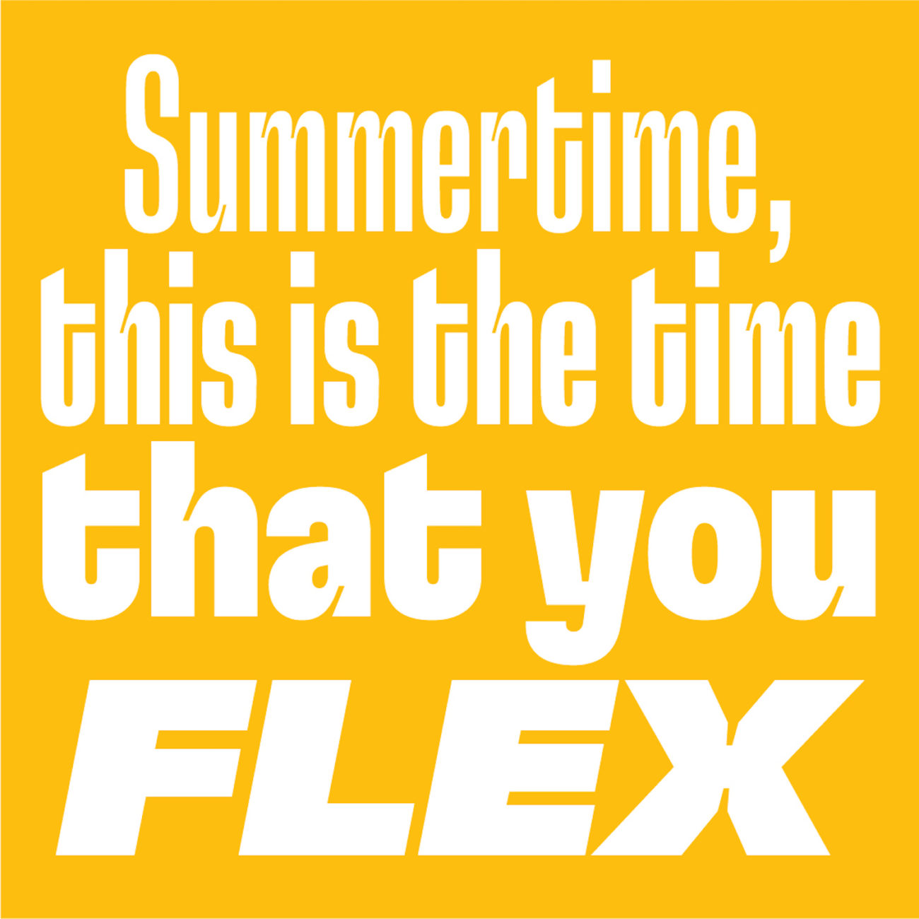
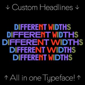
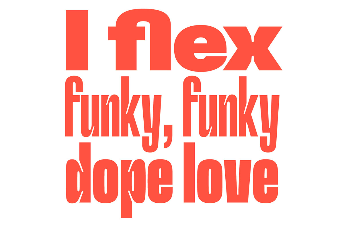
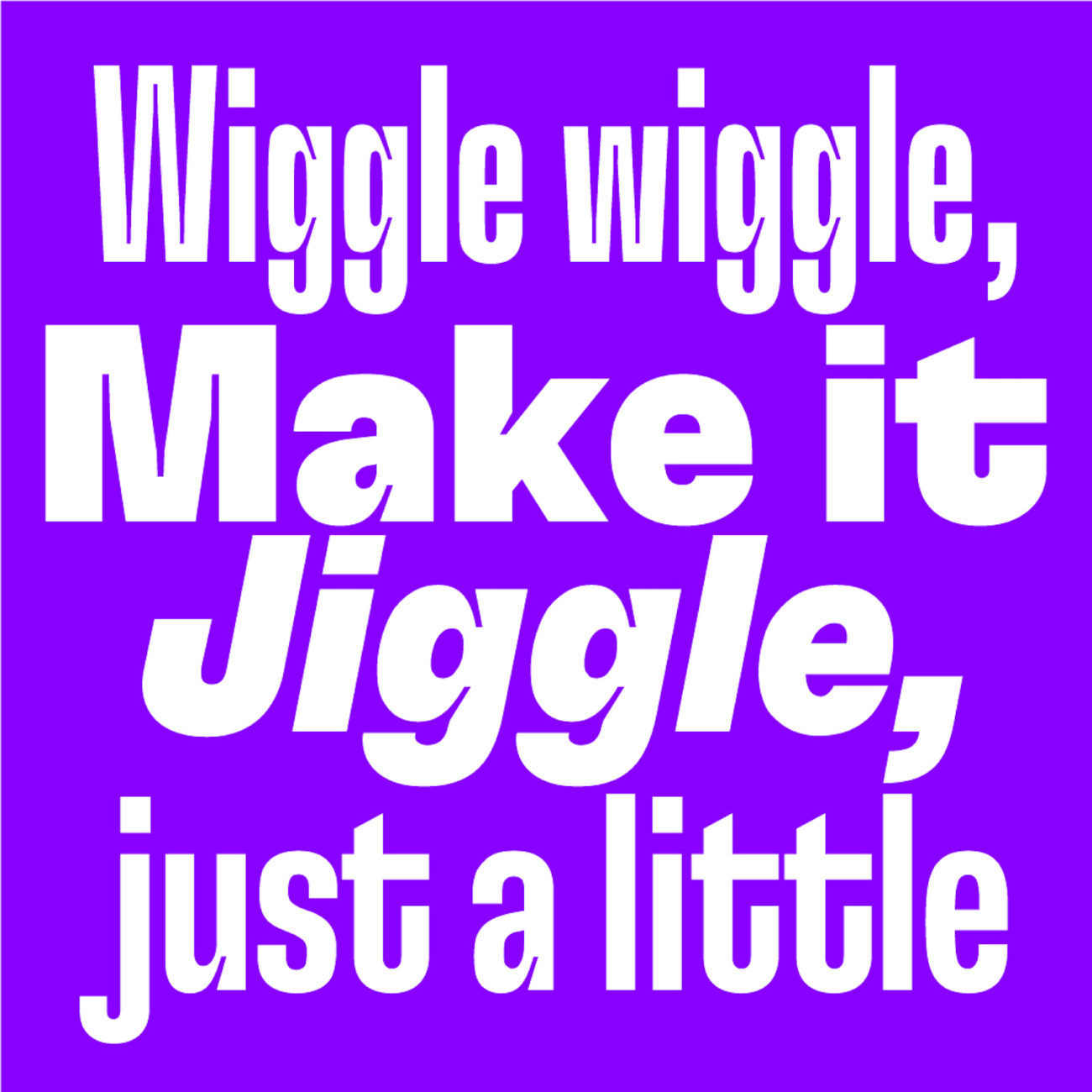
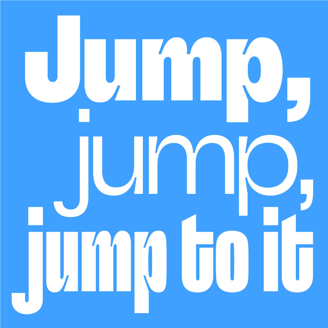
Designed by Dominik Huber with Marc Kappeler (2015 – 2020) and published by Grilli Type in July 2020, GT Flexa ‘embraces the idea of a fluid design space’, as opposed to ‘the traditional view of a typeface as a collection of static styles’. Aligned with this, the foundry describes GT Flexa as a ‘dynamic tool’. And you can totally understand why. The typeface’s variability means that GT Flexa is able to take on multiple personas and has a distinct yet malleable character; its design space running along 3 axes – Weight, Width and Italic. The delicate, perfectly formed ink traps and simple, fluid shapes mean the typeface flows spaciously and responsively in many different design spaces.

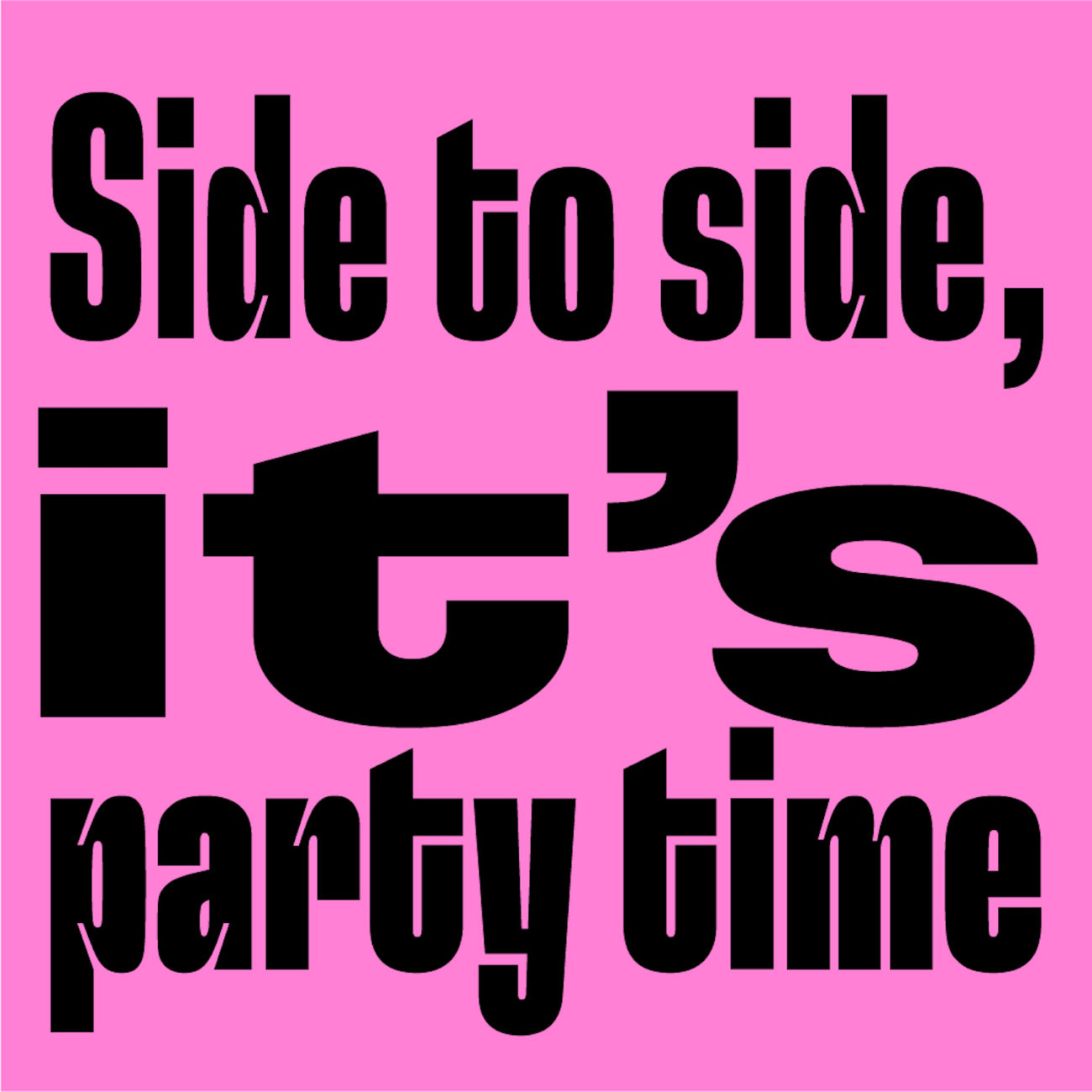
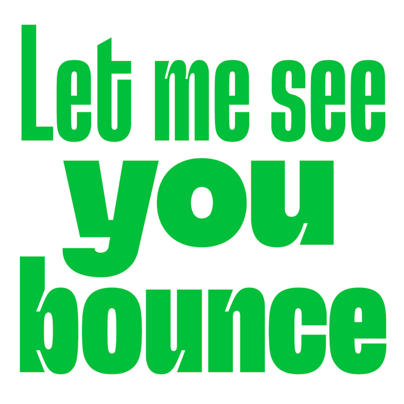
The attention to detail in GT Flexa means that it holds itself confidently and with charisma across the board in its many forms. ‘Design decisions down to the smallest details are guided by simple principles’, Grilli explain, an example of which you can see in the tightening of the letterforms when moving from the wide to narrow styles. This transition sees the ink traps brought up deeper into the body of the glyph and the terminals looping round to bring the shape together; minimising the counter space to allow for balance in the narrower kerning.


Simplicity is the definitive element in GT Flexa’s appearance, driving the overarching tone of the typeface and knitting the shapes together across their various styles. ‘The design pieces together simple shapes with minimal refinement and limited stroke contrast’, the foundry explain, ‘the resulting raw build gives it both personality and the necessary sturdiness to perform in even its most extreme states.’
With maximum variability, basic and extended Latin, full punctuation and OpenType Feature Alternatives, GT Flexa is a grotesk for every occasion. It’s fluidity allows for compositional playfulness and hyper-responsive typesetting; offering the kind variety and possibility we can only hope to see even more of in the future! To check out more from Grilli Type, check out their website and Instagram.