
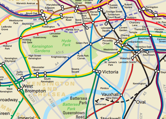
While the standard TFL map is a model of a functional map – all straight-lines and angles – it can sometimes mean that people take journeys that would actually be faster above ground.
So, someone asked TFL for a ‘geographically accurate tube and rail map‘ of London, and this is what they got. Click through for the full thing [pdf], but the part above of central London gives a good idea. It shows the as yet-unopened Crossrail (Elizabeth line) in dotted purple, and the Northern line spur to Nine Elms and Battersea (dotted black).

